HazletonEagle Posted January 24, 2023 Share Posted January 24, 2023 There are some blue things that used to be been because, eagles. Such as the plus sign to use the multi-quote feature.also the share and follow buttons at the bottom of the page. Tags under thread titles are yellow now, which is weird. They used to be green. Minor stuff that doesn't really matter, but doesn't look like what we are used to. Link to comment Share on other sites More sharing options...
VaBeach_Eagle Posted January 24, 2023 Author Share Posted January 24, 2023 12 hours ago, schuy7 said: I think the biggest thing is the dark border around each post. One that's more translucent would look better. I don't remember exactly how it looked before. How's things looking now? Link to comment Share on other sites More sharing options...
schuy7 Posted January 24, 2023 Share Posted January 24, 2023 Just now, VaBeach_Eagle said: How's things looking now? Love that change. Much better. 1 Link to comment Share on other sites More sharing options...
VaBeach_Eagle Posted January 24, 2023 Author Share Posted January 24, 2023 26 minutes ago, schuy7 said: Love that change. Much better. Notice the somewhat subtle change on the main page? Link to comment Share on other sites More sharing options...
schuy7 Posted January 24, 2023 Share Posted January 24, 2023 7 minutes ago, VaBeach_Eagle said: Notice the somewhat subtle change on the main page? Are the Eagles logos new? Link to comment Share on other sites More sharing options...
VaBeach_Eagle Posted January 24, 2023 Author Share Posted January 24, 2023 5 minutes ago, schuy7 said: Are the Eagles logos new? Yes, they used to be similar to the image below (brown in color): 1 Link to comment Share on other sites More sharing options...
schuy7 Posted January 24, 2023 Share Posted January 24, 2023 5 minutes ago, VaBeach_Eagle said: Yes, they used to be similar to the image below (brown in color): Love it. 1 Link to comment Share on other sites More sharing options...
wholesale_Melvin Posted January 24, 2023 Share Posted January 24, 2023 VA, coding for the thread/forum markers (eagles heads) needs to be adjusted. they look compressed either because of wrong ratio used (square picture fitting rectangular cell or vice versa) and/or image is too small for cell size. Link to comment Share on other sites More sharing options...
Talonblood Posted January 24, 2023 Share Posted January 24, 2023 The badge thing makes the site look cheap and silly- like my women. Can we be rid of those? Everything else is fine. Link to comment Share on other sites More sharing options...
schuy7 Posted January 24, 2023 Share Posted January 24, 2023 How do we feel about the badges? I don't know if it's possible for them to be removed, but I don't like the way it covers our avatars/profile pictures, and it's just unnecessary. I'd like to see our normal reputation point somewhere instead. Link to comment Share on other sites More sharing options...
wholesale_Melvin Posted January 24, 2023 Share Posted January 24, 2023 3 minutes ago, schuy7 said: How do we feel about the badges? I don't know if it's possible for them to be removed, but I don't like the way it covers our avatars/profile pictures, and it's just unnecessary. I'd like to see our normal reputation point somewhere instead. 1 Link to comment Share on other sites More sharing options...
Mike030270 Posted January 24, 2023 Share Posted January 24, 2023 24 minutes ago, schuy7 said: How do we feel about the badges? I don't know if it's possible for them to be removed, but I don't like the way it covers our avatars/profile pictures, and it's just unnecessary. I'd like to see our normal reputation point somewhere instead. I think it's just interacting with the site. I've had a notification after liking a post and just posting Link to comment Share on other sites More sharing options...
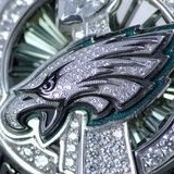
VaBeach_Eagle Posted January 24, 2023 Author Share Posted January 24, 2023 1 hour ago, wholesale_Melvin said: VA, coding for the thread/forum markers (eagles heads) needs to be adjusted. they look compressed either because of wrong ratio used (square picture fitting rectangular cell or vice versa) and/or image is too small for cell size. Be sure to either quote or tag me, or I may not see the post for a while. These are the logo's that you're speaking of: I'll see if they can be adjusted, but it may just be how the software has to alter them to fit. The actual images that are being used, are scaled properly but the board software has to adjust them to fit that area. Link to comment Share on other sites More sharing options...
VaBeach_Eagle Posted January 24, 2023 Author Share Posted January 24, 2023 1 hour ago, Talonblood said: The badge thing makes the site look cheap and silly- like my women. Can we be rid of those? Everything else is fine. I'm not sure. You're talking about the rank on each avatar? That's actually different from the badges that are earned. Link to comment Share on other sites More sharing options...
wholesale_Melvin Posted January 24, 2023 Share Posted January 24, 2023 57 minutes ago, VaBeach_Eagle said: Be sure to either quote or tag me, or I may not see the post for a while. These are the logo's that you're speaking of: I'll see if they can be adjusted, but it may just be how the software has to alter them to fit. The actual images that are being used, are scaled properly but the board software has to adjust them to fit that area. @VaBeach_Eagle looks clearer on phone (eaglehead) but still like a rectangular image fitting into a square. Link to comment Share on other sites More sharing options...
VaBeach_Eagle Posted January 24, 2023 Author Share Posted January 24, 2023 10 minutes ago, wholesale_Melvin said: @VaBeach_Eagle looks clearer on phone (eaglehead) but still like a rectangular image fitting into a square. Can you do a screen shot for me? Link to comment Share on other sites More sharing options...
wholesale_Melvin Posted January 24, 2023 Share Posted January 24, 2023 1 minute ago, VaBeach_Eagle said: Can you do a screen shot for me? @VaBeach_Eagle Link to comment Share on other sites More sharing options...
Talonblood Posted January 24, 2023 Share Posted January 24, 2023 1 hour ago, VaBeach_Eagle said: I'm not sure. You're talking about the rank on each avatar? That's actually different from the badges that are earned. Yeah- on the avatar itself. Link to comment Share on other sites More sharing options...
VaBeach_Eagle Posted January 24, 2023 Author Share Posted January 24, 2023 19 minutes ago, wholesale_Melvin said: @VaBeach_Eagle I might be able to have them sized a little smaller. Link to comment Share on other sites More sharing options...
VaBeach_Eagle Posted January 24, 2023 Author Share Posted January 24, 2023 20 minutes ago, Talonblood said: Yeah- on the avatar itself. I'm not sure on that, but I'll look into it. 1 Link to comment Share on other sites More sharing options...
wholesale_Melvin Posted January 24, 2023 Share Posted January 24, 2023 1 hour ago, VaBeach_Eagle said: I might be able to have them sized a little smaller. @VaBeach_Eagle with the way the script has that graphic so close to the text, i'm thinking more and more the actual graphic will need to be a square ratio. If something square works but the image shrinks too much to do so, try (download) these and see if the square ratio helps. they're 80x80px so may have to resize to fit available area (40px?) Link to comment Share on other sites More sharing options...
Captain F Posted January 25, 2023 Share Posted January 25, 2023 I haven't looked at all of the comments but.... The pages are too large. My notifications bell at the top right corner is off the page. I can only see it if I turn my phone sideways. You can see here the 3 lines but when a notification comes in, it all shifts to the right and is off the screen. I have pinched my screen as small as it will go. Not sure if there's another way to get the page smaller Link to comment Share on other sites More sharing options...
Captain F Posted January 25, 2023 Share Posted January 25, 2023 Better picture. Look where the notification is. I can't click on it without rotating my phone Link to comment Share on other sites More sharing options...
HazletonEagle Posted January 25, 2023 Share Posted January 25, 2023 16 minutes ago, Captain F said: Better picture. Look where the notification is. I can't click on it without rotating my phone You're just trying to show off your 0 warning points. 1 Link to comment Share on other sites More sharing options...
Talonblood Posted January 25, 2023 Share Posted January 25, 2023 2 hours ago, VaBeach_Eagle said: I'm not sure on that, but I'll look into it. If not, no worries- you have done a great job with this place. 1 Link to comment Share on other sites More sharing options...

Recommended Posts
Create an account or sign in to comment
You need to be a member in order to leave a comment
Create an account
Sign up for a new account in our community. It's easy!
Register a new accountSign in
Already have an account? Sign in here.
Sign In Now